
The Process
This project was developed during The Donald Knuth & Charles Bigelow Type Design Incubator (KBI), powered by SILICON at Stanford University, in partnership with Words of Type and Letterform Archive.
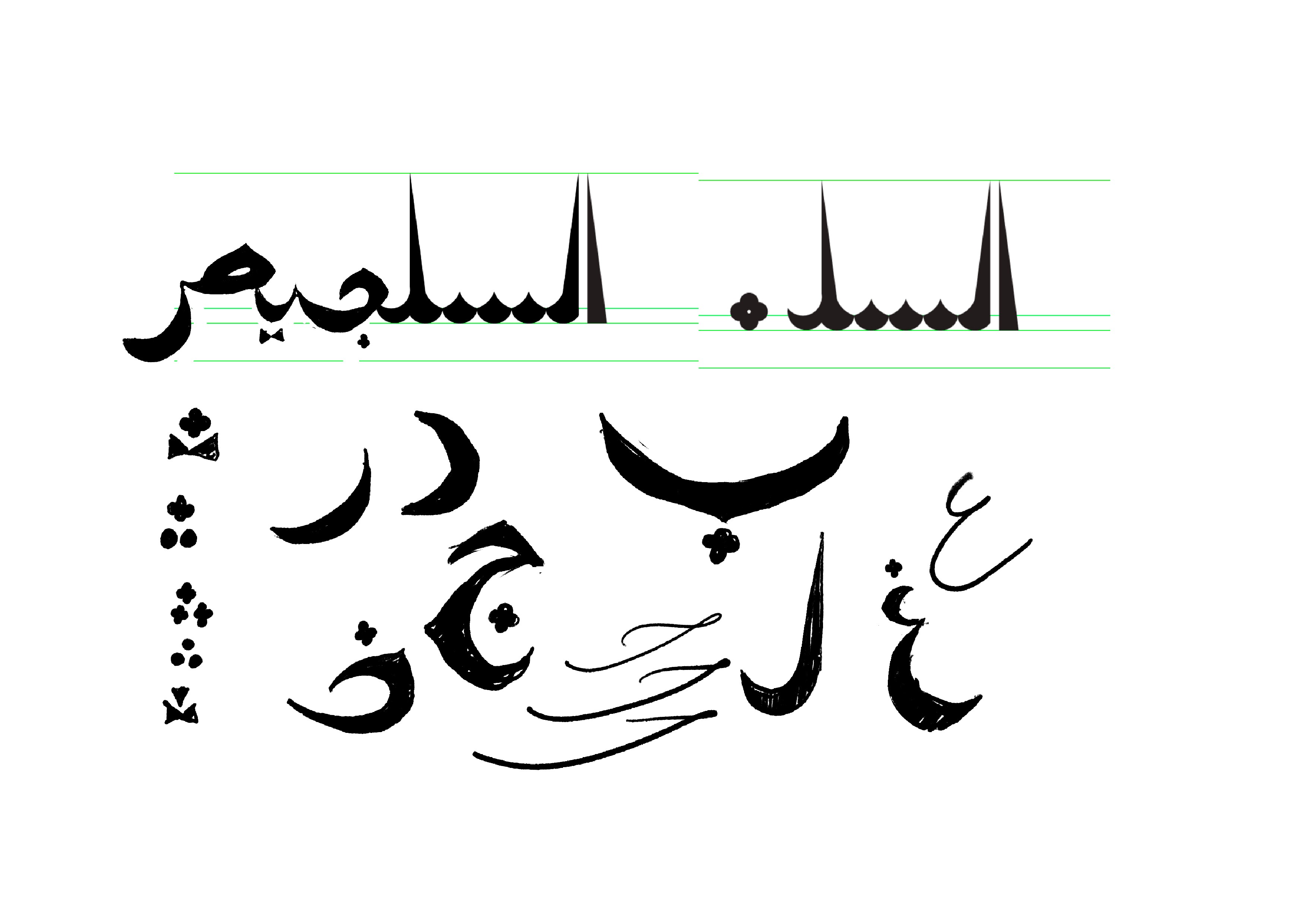
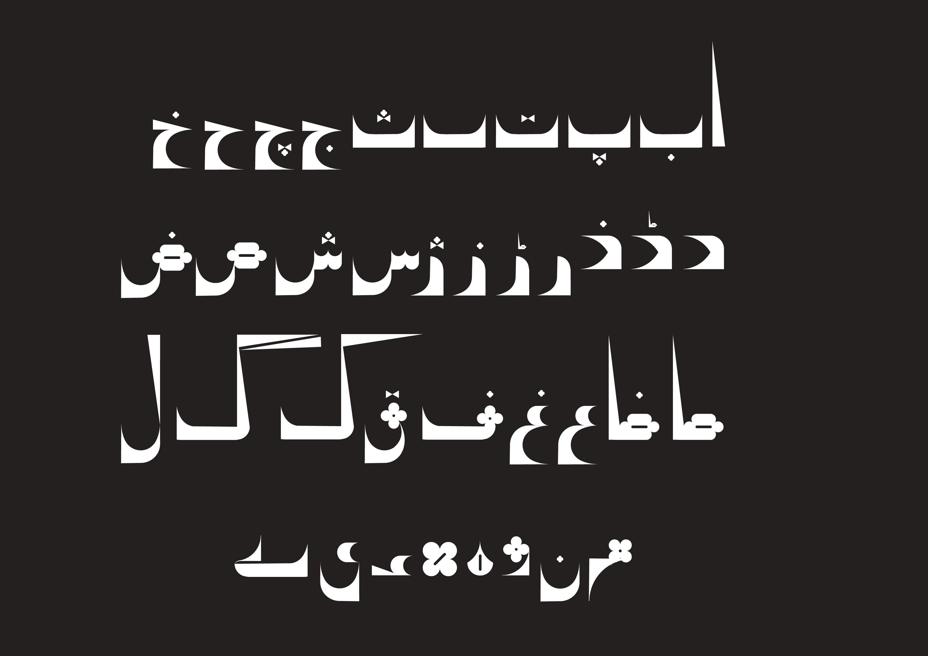
Urdu used to have a very vibrant design culture before the full use of computer graphics took over, and fonts became monotone and frankly lacking character. Most books today either have the standard Nastaliq (which itself doesn't translate well as a typeface *long story*), or a variation of Naskh. Experimental typography is rare to find, and often only built as hand lettering, rather than a font.
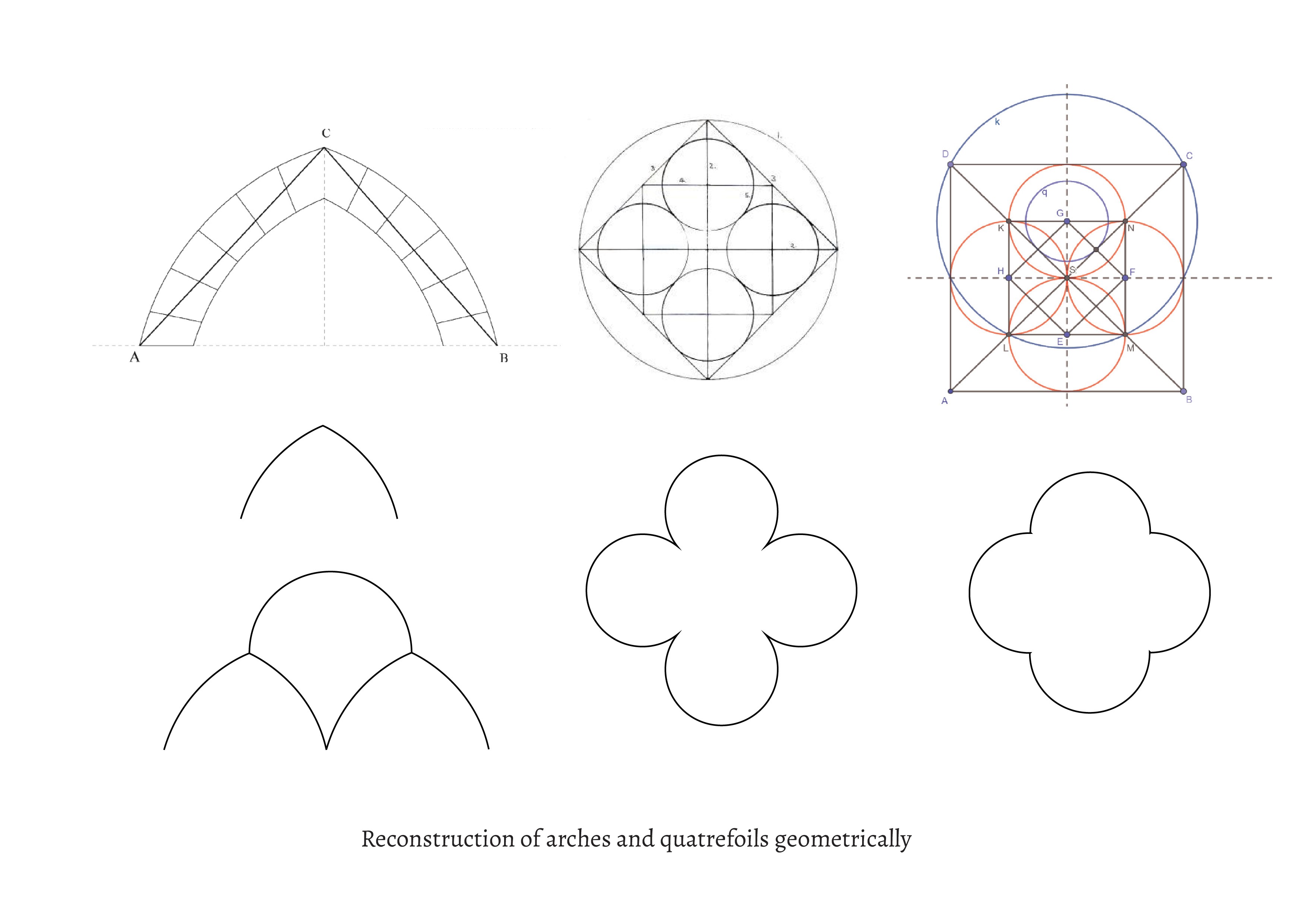
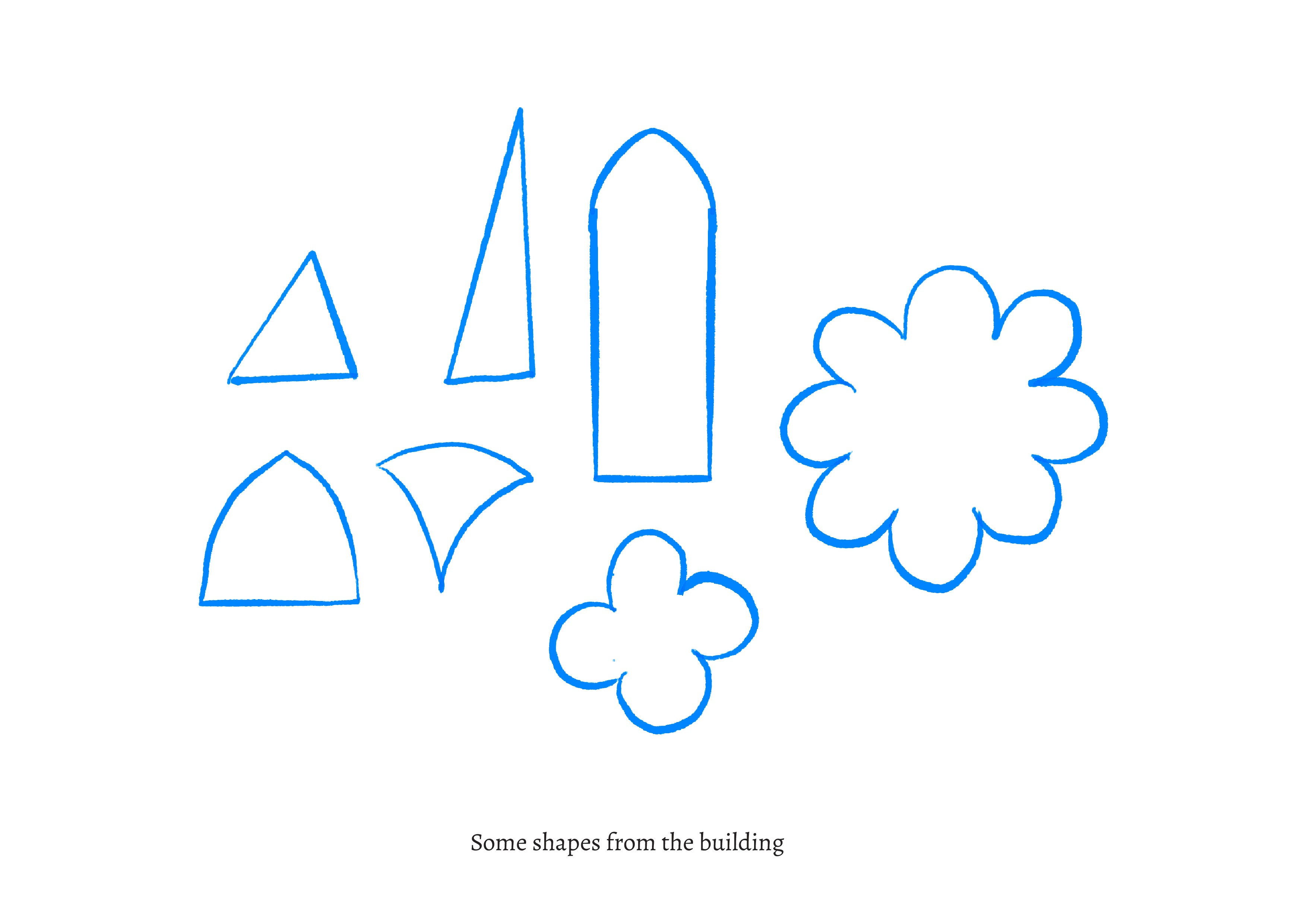
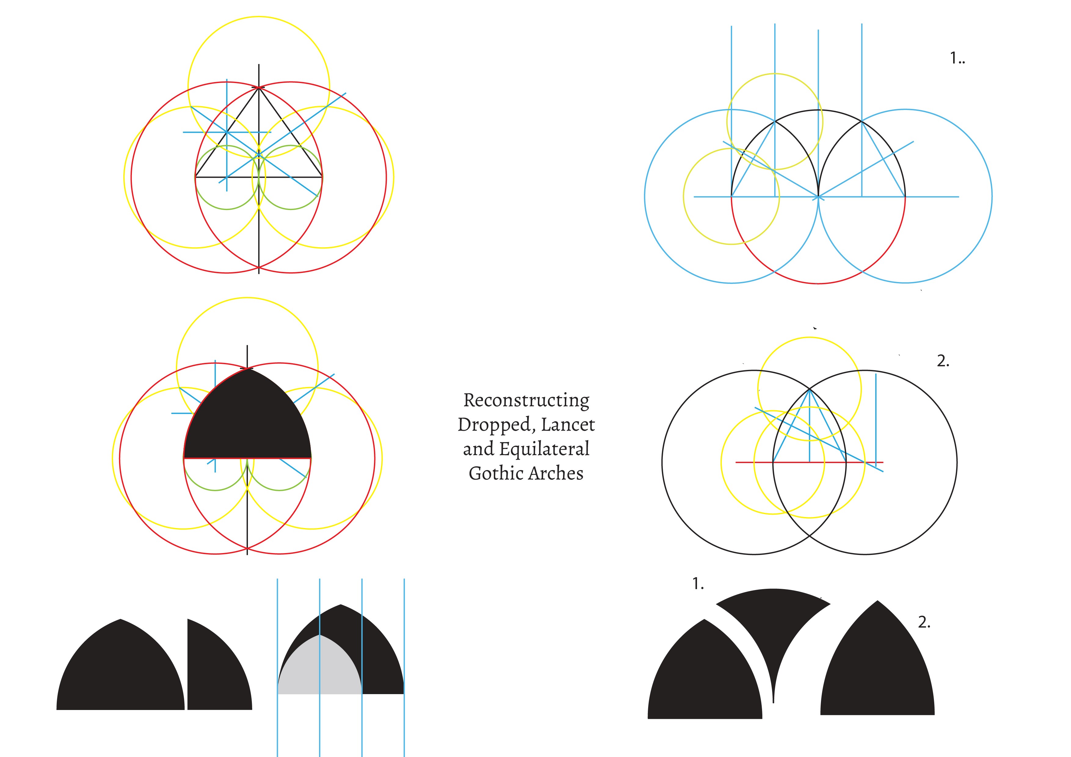
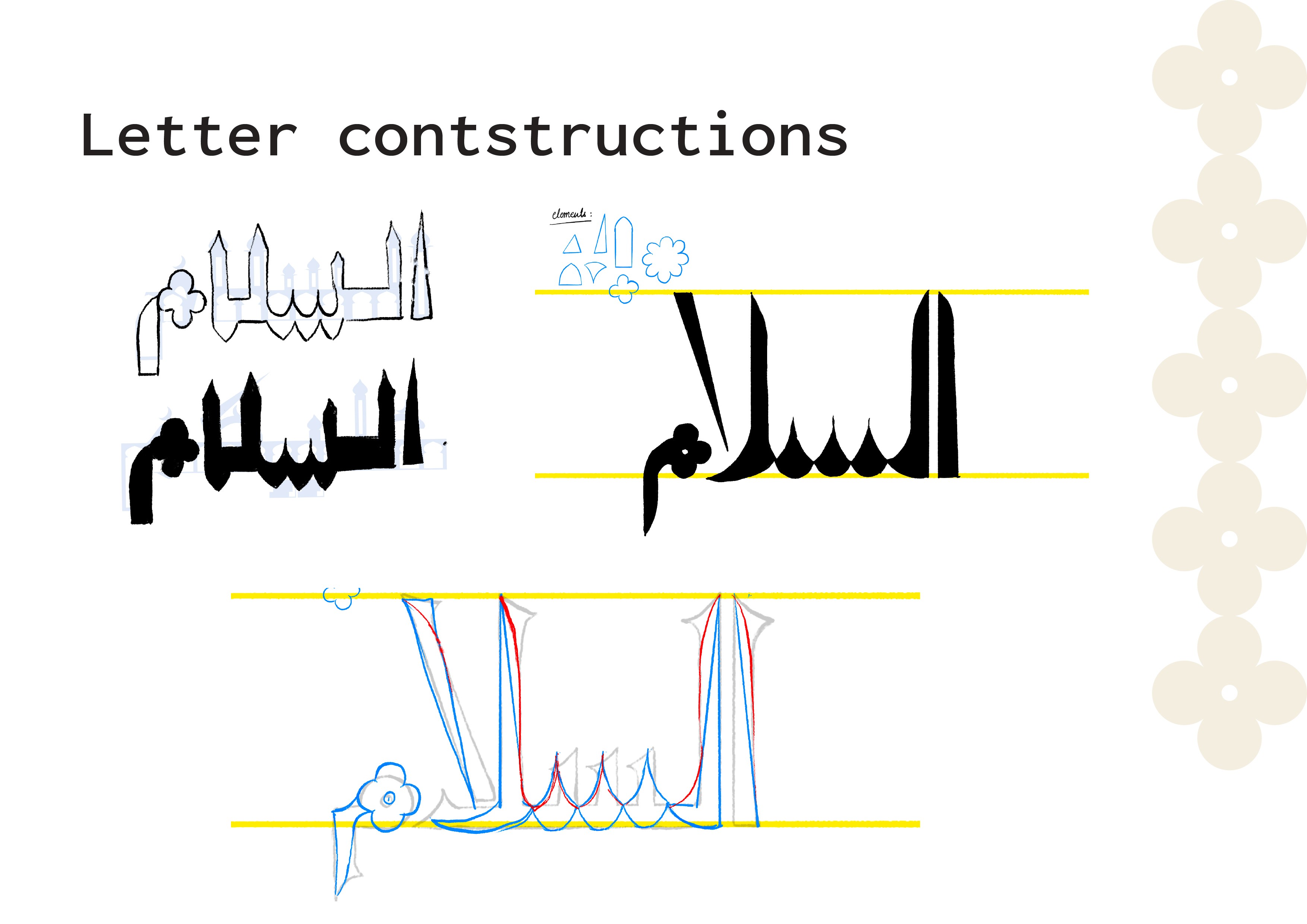
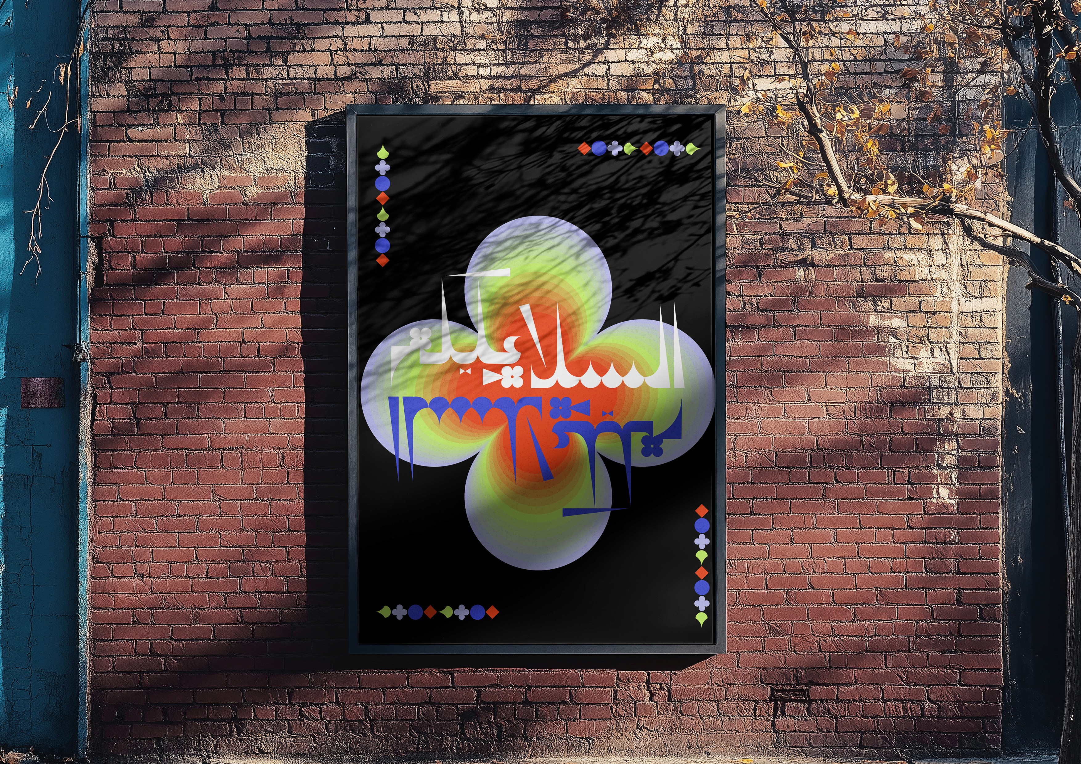
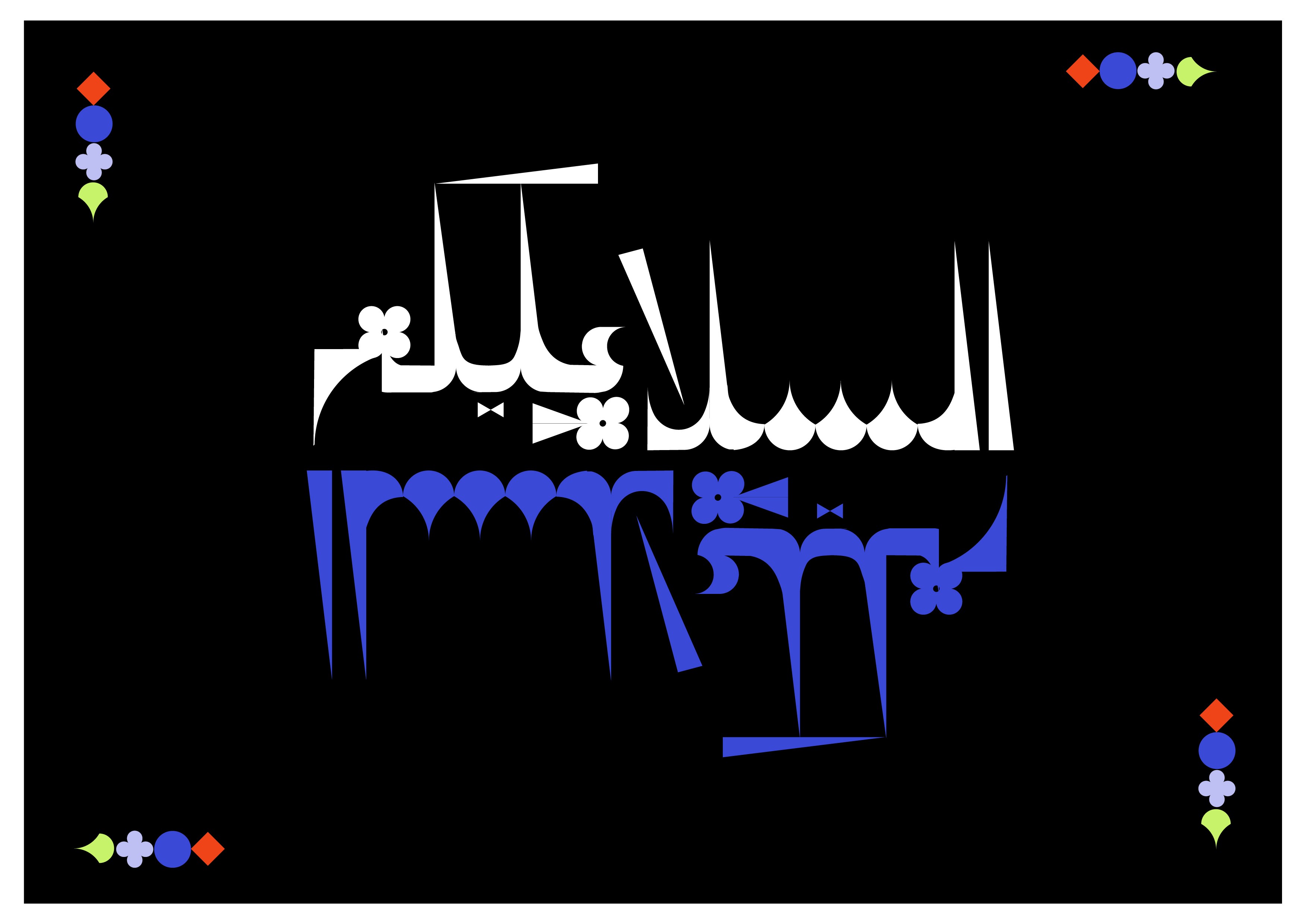
The font draws inspiration from the dramatic arches, pointed spires, and textured façades of Karachi’s Gothic architecture, particularly Frere Hall, a personal point of reference and my favourite place in the city. It merges Eastern and Western design languages by layering the Urdu script with the rigid structure of Fatimid Kufic and the ornamentation of Gothic forms.
Gothic Urdu Display Typeface is a nod to Karachi’s colonial-era architecture with an Urdu twist. The font is best suited for titles, headlines, and visual experiments.
What We Used
Formal references from Gothic architecture, Fatimid Kufic geometry, and Urdu script traditions were combined to build a display type that is both architectural and experimental.


Check Out Our Services
OUR WORK